|
Throughout this entire year that I've been in Digital Design and Art 1, I've acquired many skills from many different software's and overall increased my knowledge of technology. The first thing I'd like to talk about is how I've been able to learn so much in Photoshop. Photoshop I think is the one software that I'll continue to use primarily throughout my life. We've been able to use so many different Adobe software's but I think that Adobe Photoshop is the one that kinda combines all the good things that the others have, and put it all into one. Photoshop has an insane amount of applications and is fairly simple to use. The thing about Photoshop that is so great is how it has such a learning curve. Even right when you start out and don't understand 90% of the interface, you still have a lot at your disposal. Even if you only know how to just use filters or how to just use blending, you still can do so much with what you have. Another piece of software that I really enjoyed using because of how simple yet useful it is, is Premiere. If I ever create a video for anything, it is super simple to make that video a whole lot better by using Premiere. Adobe Premiere can let you adjust audio levels, add background music, create new transitions and a lot more. Overall, one big takeaway I've received from this class is simply how I have adapted to understanding the interface of basically anything in a more precise manner. Before my year in Digital design, whenever I would look at a complicated interface such as Photoshop, I wouldn't know how or where to start. Now that I've been able to use many different software's throughout the course of a year, I am much more able to understand the interface of any website or software with much more ease. This year in Digital Design has been amazing in how it has thoroughly developed my skill and knowledge of digital history, software and animation. Summary -
 Visual Map Year Overview
7 Comments
Throughout the fourth quarter of my freshman year here at DSA, I've been working with 3d Studio Max in my Digital Design and Media class. I've expanded my knowledge and understanding of how the interface works, how to manipulate objects with more ease, and I've simply become quicker at working with this software. Some things that I have noticed that I've gotten better at are things like understanding what all the tools do and how to not accidentally move an object way off to the side and then not be able to find it.  The image above is an example of my work where if you compare it to some of my work from the beginning of this quarter, it's much higher quality and looks way better. Some things I still mess up in 3d Studio max are knowing and remembering keybinds and remembering what each modifier that I currently know how to use does. A tool that we just recently learned how to use is the line tool. This tool works in a very similar way to the pen tool in photoshop, illustrator, etc. This tool allows you to create your own custom shapes with somewhat ease. Some issues that I ran into when using this tool is knowing what to draw with the line that would work well with the lace modifier. For example, for the cup I created half of it, and then used the lace modifier. If I were to try and draw the whole cup with the line, it would make a jumbled mess that doesn't look anything like my intended shape. Conclusion-
 Snowman created in 3ds max Over the past couple of weeks, we've been working in 3ds max over several different projects. I've currently made a snowman, a pencil, and a tank. Some worries that I have about moving forward in 3ds max is how I currently only really know about 10% of the interface if even that much. Some problems that I've run into is simply how power hungry the software is. My computer has crashed in 3ds max at least 10 times and it takes forever for it to even start up. Another problem I have is how easy it is to mess up and object. If you have the extrude tool accidentally selected when you're trying to mess with your object, you can very easily mess up your object by dragging it excessively with even the slightest mouse movement. Another worry I have is that I don't think I'll really ever be able to make my own object without a guide given online. It seems so impossible to manipulate an object with enough precision and accuracy. With my current state of experience, I think that I could create some simple objects on my own such as a cup, or fork maybe. I hope that moving forward my level of expertise greatly increases because I kinda feel like I actually don't know anything about the software. Hopefully, after I learn the interface to a greater depth, I'll know much more about how to edit my objects in a more efficient manner than what I currently know. Conclusion -
Over the past couple of weeks, we've been working in different Motion-Based Applications. These are Adobe Animate, Adobe After Effects and now we're moving into Premiere. Although I have done basically nothing in Premiere so far, I have a good understanding of some of the similarities and differences between After Effects and Animate. One thing to note off the bat is how After Effects is solely based off of using several different images to create an animation which is known as the traditional way of animation. Animate on the other hand allows you to use keyframing and tweens as well as the traditional style. I think creating animation in After Effects is MUCH more tedious than in Animate, but for me at least it was a lot easier to understand. In Adobe Animate I struggled over and over dealing with the Shape Hints to correctly make my animation fluid and not choppy. If you screw up your shape hints and don't choose the right type of easing, your animation will look terrible. In After Effects there are certain styles that you can choose to make your objects move or transform on the screen such as making them dilate, rotate, move and a couple more. I found Adobe After Effects to have a bit more of a complex looking interface but it was easier to pick up. One other difference that I noticed is how Adobe Animate seemed to allow you to create much more complex types of animation unlike After Effects, where it seems like the majority of what you can do in it is make text, lines, and shapes move on the screen. Conclusion
Over the past couple of weeks, we've been working in Adobe Animate with 2 different projects. We've had the opportunity to use this software and really try to learn as much as we can about it. Currently, I've only done one of the 2 projects but I still have many opinions to share on this new software. One of my initial reactions was that the interface of Animate is very different than the other Adobe softwares that I have used. There are still some of the same things from previous ones though, for example, there are many of the same tools. One tool that is used heavily in Adobe Animate is the pen tool. You typically use it to create whatever you're trying to animate. For my first project, I used the pen tool to create the body, mouth, and teeth of the monster that I animated. One thing that I think is true is that the pen tool works exactly the same as in the previous programs (I might be wrong on this). One thing I consistently had trouble with was the remembering of how to create each different tween and how to create new keyframes. Since we typically don't spend that much time in one program, it can sometimes be really annoying to become familiar with the interface and be comfortable with it. With that being said, as I move into my next project I have some concerns with how I'm going to create my animation as for the next one we will have no guided video. Conclusion -
Idle Animations in video games are a key element to making the game look amazing visually. For this post I'd like to talk about not just one but two of my favorite Idle Animations in video games that I find amazing.  Super Mario Odyssey Shiver Idle Animation The first I'd like to talk about is Mario's shiver animation that occurs when you are in an area with lower temperatures and you leave the controller unattended. What I find great about this that it adds to the environment that the player is in by making the player really feel as if they are in a colder area. In Super Mario Odyssey Mario will also sweat and get tired when in hotter areas of the game. The reason why I really find these details interesting is because the game has multiple different idle animations for different parts of the game.  Ocarina of Time Link Adjusting Belt Idle Animation Another of my favorites is in Ocarina of Time where Link will adjust his belt if the game is left alone for a while. The reason why this is such a great idle animation is because it works so naturally and makes the game look much more real even for an older game such as this. Animations such as this can make a game seem so much more alive than other games where the character will just stand still when not moving. Idle animations are one of the things that can be seen as a small detail that makes a huge impact on how the game looks and feels. Idle animations can make a game go from lifeless to lively. Conclusion -
Over the past couple of weeks, we've been developing our skills in Illustrator and we are beginning to change path over to Animation. For this blog post, I chose the topic of Stop Motion Animation as I find it interesting how realistic some of these films can be. For those who don't know, Stop Motion Animation is basically where someone takes several photos in small increments to create the illusion of motion. What you do while creating this is you take whatever the scene you're filming and very slightly alter the scene as if it would be a split second later over and over again. Some of the most famous stop motion animations include The Nightmare Before Christmas, Coraline, and Fantastic Mr. Fox. I think that my some of my skills from Photoshop and Illustrator will help transfer over as they have taught me how to use a program and how to approach learning new software. The link above is a video of an example of a way that you can use stop motion. The entire scene doesn't have to be completely stop motion, instead, you can have green screens set up to add to the scene to make it more complex. This link is a for a video where a stop motion animator goes into detail on how he does his job and how it's performed. I found this video very interesting because it shows you how much effort and detail they put into these films and it really allows you to see just how much time they spend on their work. Conclusion
Work Cited
Originals, Academy, director. Credited As: Stop Motion Animator. YouTube, YouTube, 21 Dec. 2015, www.youtube.com/watch?v=ij3IbplMisAv. Parry, Kevin, director. STOP MOTION Animation Reel. YouTube, YouTube, 14 Oct. 2018, www.youtube.com/watch?v=UCVXWk2im2M. After our various projects in Adobe Photoshop, we are moving on to Adobe Illustrator. The biggest difference between the two is how Photoshop uses bitmap graphics while Illustrator uses vector. Illustrator is mostly strictly using certain shape tools in various and unique ways to make an image. Photoshop and Illustrator have a lot of similar tools and a layout that works and looks almost the same as each other.  Some things that I have noticed from looking at some videos of excellent uses of Illustrator is how that the software can be used to such high extents that allow the user to create a beautiful masterpiece. The software can be used for some very complex large artworks that have an amazing look and feel to them although the software can be used by beginners to make simple things such as easy icons. Recently in class we have been working on creating badges in Illustrator (Image above is not my work). As I worked with the software I realized that such a simple concept of using shapes is a very easy way to create basic but effective art pieces with very little knowledge of how to use the program. You have multiple shape tools that have a bunch of settings to change the amount of sides, the size of the shape, etc. So far we have been exploring a small amount of each tool and how to use the shape builder tool to allow us to cut certain shapes to our liking. So far I am preferring Illustrator over Photoshop. Conclusion -
Citations -
Ujjainkar, Prashant. “ADOBE ILLUSTRATOR BADGE.” DESIGN WITH PRASHANT, designwithprashant.blogspot.com/2017/05/adobe-illustrator-badge-design-with.html. Staff, Digital Arts. “There's a New Gradient Tool Coming to Adobe Illustrator.” Digital Arts, Macworld UK, www.digitalartsonline.co.uk/news/creative-software/new-gradient-tool-adobe-illustrator/. Over the past couple of weeks, we have been working with bitmap graphics in Photoshop. We've been practicing using multiple different tools, but one tool that I have found to be one of the most useful was the Quick Selection Tool.  The image above is an example of a usage for the quick selection tool. We took a black and white photo and converted it to color using blend modes. I used the quick selection tool to select certain parts of the image specifically and converted them to color. The tool allowed me to make very precise selections to make sure everything was changed correctly. I have found out that the tool is the most useful when used in combination with the pan tool and magnify tool. Using these tools in combination with quick selection allows you to make precise selections up to the pixel. Another tool that I have found extremely useful in Photoshop is the Quick Mask Tool. This tool allows you to remove portions of an image and it will not destroy the edited portions.  The image above is an example of a usage of the quick mask tool. I used different images from the internet and merged them together to form a sandwich. I used the quick mask tool to remove the white border from each image, as a white border would result in a very non-realistic looking image. The tool allows for a very quick solution to remove parts of an image that are unwanted with ease. There are multiple more applications of this tool than just the example shown above. Conclusion -
Citations -
Gerondelis, James. “James Gerondelis.” James Gerondelis, 2018, jgerondelis.weebly.com/. (Citation for both images used) Since I've been in GAD I've learned several things from the class. Some including different composition techniques from photos, quick masking, information on copyright and more. Sometimes it's interesting to look at multiple images and see different elements of design composed into the image. Here are a few examples that I find interesting.  This is a photo from Legend of Zelda Breath of the Wild. This image uses several visual elements that compose the photo. One example of an element used is the rule of thirds. The image clearly puts the person on the horizontal and vertical lines, immediately drawing the attention to him. Another element used in this image is contrast. The person is a darker color, with a shadow on him, contrasting with a bright, blinding sky. Another part of how contrast is a part of this photo is how the person and the rock and grass below him, are all in full clear high definition. The background, on the other hand, is slightly blurred, allowing the focus to stay mainly on the hero on the rock. 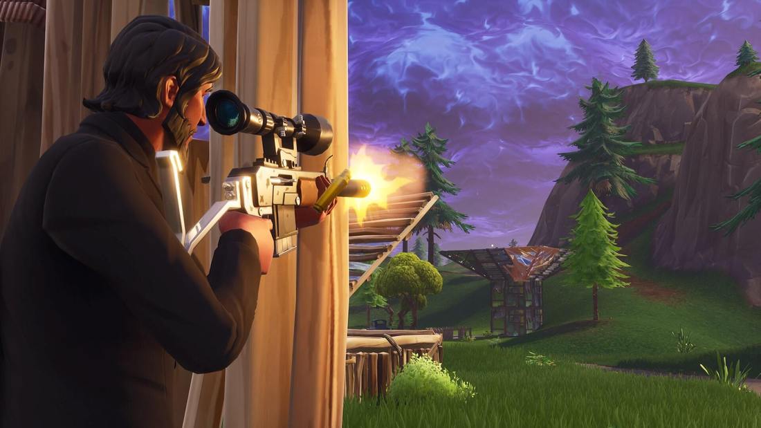 This is a photo from Fortnite. This photo also uses several visual elements that compose the image. One example of an element used in this is emphasis. The photo emphasizes on the person on the left as he is placed on the spot where the eye naturally looks first (goes along with the rule of thirds), the person is wearing all black which contrasts with the rest of the colors of the image, and he is the largest thing on the whole screen. Conclusion -
MLA Citations -
BagoGames. “The Legend of Zelda: Breath of the Wild Review.” Flickr, Yahoo!, 11 Mar. 2017, www.flickr.com/photos/bagogames/32994737230/in/photostream/. Pillay, Lance. “Free Stock Photo of Battleroyale, Fortnite.” Free Stock Photos, www.pexels.com/photo/battleroyale-fortnite-1158215/. |
