|
Since I've been in GAD I've learned several things from the class. Some including different composition techniques from photos, quick masking, information on copyright and more. Sometimes it's interesting to look at multiple images and see different elements of design composed into the image. Here are a few examples that I find interesting.  This is a photo from Legend of Zelda Breath of the Wild. This image uses several visual elements that compose the photo. One example of an element used is the rule of thirds. The image clearly puts the person on the horizontal and vertical lines, immediately drawing the attention to him. Another element used in this image is contrast. The person is a darker color, with a shadow on him, contrasting with a bright, blinding sky. Another part of how contrast is a part of this photo is how the person and the rock and grass below him, are all in full clear high definition. The background, on the other hand, is slightly blurred, allowing the focus to stay mainly on the hero on the rock. 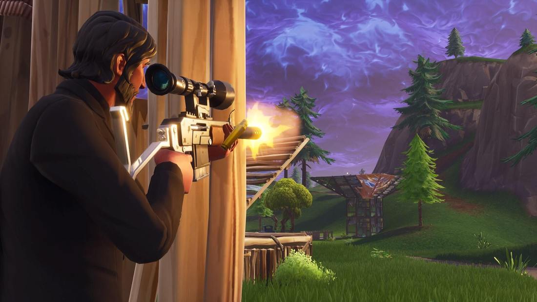 This is a photo from Fortnite. This photo also uses several visual elements that compose the image. One example of an element used in this is emphasis. The photo emphasizes on the person on the left as he is placed on the spot where the eye naturally looks first (goes along with the rule of thirds), the person is wearing all black which contrasts with the rest of the colors of the image, and he is the largest thing on the whole screen. Conclusion -
MLA Citations -
BagoGames. “The Legend of Zelda: Breath of the Wild Review.” Flickr, Yahoo!, 11 Mar. 2017, www.flickr.com/photos/bagogames/32994737230/in/photostream/. Pillay, Lance. “Free Stock Photo of Battleroyale, Fortnite.” Free Stock Photos, www.pexels.com/photo/battleroyale-fortnite-1158215/.
0 Comments
After finally being done playing Fortnite, I have an immense amount of feedback for the game to help improve its overall fairness, strategic balance, and how fun the game is in general. In my opinion, Fortnite is a well-balanced game with small poor details to the components of how certain guns and techniques work. For starters, double shotgun. In my opinion, double shotgun at first was completely unbalanced and unfair and it was a good decision to remove it. Although it was unfair at first, when it returned in season four with a "nerfed" or toned down/worse version, it was completely balanced. The player had the option to use double shotgun or shotgun and smg and both of these worked equally well and were completely balanced. In my opinion, it was a bad move to remove it completely in season five where the player is forced to use a shotgun and a smg. The reason why I believe this is unbalanced is because when the player switches to the smg, the bloom of the gun greatly impacts how the player shoots and is highly luck based if each bullet hits. Another unfair change to the game is how you can no longer see through edits. This makes it so high skilled players who can edit their builds quickly, can't see where the player is through the edit, making the edit much less useful. This lowers the skill gap between very good players and newer ones but also makes the game much less skill based.
Summary:
The last week we've been learning about composition techniques and elements of photos. After watching some of the videos on how the composition techniques are used in photos I can fully understand how certain pictures stand out much more than others.
I'm surprised on how much even just leading lines in a photo alone can direct the viewer's attention so well to exactly what the artist wants them to see. The technique is amazing in how it can completely change a photo. Another technique that I find quite amazing is how the artist uses blur to focus the image on a specific point or part of the picture. Using blur in an image can completely change the center of focus regardless of other details. One of the best ways to use leading lines, in my opinion, is roads, as it's a natural lead towards the center of focus, and the sides of the road naturally lead inwards. Another thing that I have learned from composition techniques is how when a picture includes none of these, the image is unpleasing and unsettling to look at, as our eyes don't know what to focus on. It's interesting to see how well some artists can weave these techniques into their photos so smoothly and naturally. For example in one of the videos that I saw the artist used the edges of the chameleon and its tail to smoothly direct the attention to the face of the animal. One of the examples of repetition in the video was a bunch of trees on the side of a road, which directed the attention inwards on the photo. These techniques are completely mind blowing on how well a photo can be improved by using them.
Legend of Zelda Breath of the Wild is a great example of the influence and importance of color usage in a video game. This game uses very calming and sort of brighter colors to convey a nature-like feel of the game. The game very specifically uses certain colors to convey certain feelings of the environment dependent on where the player is. This game uses a LOT of green as this color typically is associated with nature and life as the game is very heavily in the wild hence the title. This game also uses a lot of different shades of gray to sort of show a type of rustic feel to the game as the game is based 100 years after the fall of Hyrule, in the ruins. The creator of this game used different shades of colors making very beautiful sunsets, sunrises, and lots of different types of plants all uniquely made as the color scheme slightly differs with each. The game uses color scheme to make everything in the game feel fresh, unique, and visually appealing. Breath of the Wild uses colors to fully immerse the player in the environment they are in. For instance if they are at beach area, the colors will be brighter and more calming. The player is always able to correctly interpret where they are and the player can fully appreciate the realistic graphics. If this game was in grayscale, the game would have a completely different feel and wouldn't be nearly as immersive. The player wouldn't convey any emotion from any environment, the game wouldn't be nearly as realistic. In conclusion, the creators of Breath of the Wild used color scheme in a way that very well conveys a realistic environment.
MLA Citation Chalupa, Brett. “The Legend of Zelda - Breath of the Wild - Title Screen.” Flickr, Yahoo!, 18 Mar. 2017, www.flickr.com/photos/brettchalupa/33477550306. |
