|
Since I've been in GAD I've learned several things from the class. Some including different composition techniques from photos, quick masking, information on copyright and more. Sometimes it's interesting to look at multiple images and see different elements of design composed into the image. Here are a few examples that I find interesting.  This is a photo from Legend of Zelda Breath of the Wild. This image uses several visual elements that compose the photo. One example of an element used is the rule of thirds. The image clearly puts the person on the horizontal and vertical lines, immediately drawing the attention to him. Another element used in this image is contrast. The person is a darker color, with a shadow on him, contrasting with a bright, blinding sky. Another part of how contrast is a part of this photo is how the person and the rock and grass below him, are all in full clear high definition. The background, on the other hand, is slightly blurred, allowing the focus to stay mainly on the hero on the rock. 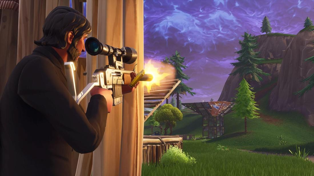 This is a photo from Fortnite. This photo also uses several visual elements that compose the image. One example of an element used in this is emphasis. The photo emphasizes on the person on the left as he is placed on the spot where the eye naturally looks first (goes along with the rule of thirds), the person is wearing all black which contrasts with the rest of the colors of the image, and he is the largest thing on the whole screen. Conclusion -
MLA Citations -
BagoGames. “The Legend of Zelda: Breath of the Wild Review.” Flickr, Yahoo!, 11 Mar. 2017, www.flickr.com/photos/bagogames/32994737230/in/photostream/. Pillay, Lance. “Free Stock Photo of Battleroyale, Fortnite.” Free Stock Photos, www.pexels.com/photo/battleroyale-fortnite-1158215/.
0 Comments
Legend of Zelda Breath of the Wild is a great example of the influence and importance of color usage in a video game. This game uses very calming and sort of brighter colors to convey a nature-like feel of the game. The game very specifically uses certain colors to convey certain feelings of the environment dependent on where the player is. This game uses a LOT of green as this color typically is associated with nature and life as the game is very heavily in the wild hence the title. This game also uses a lot of different shades of gray to sort of show a type of rustic feel to the game as the game is based 100 years after the fall of Hyrule, in the ruins. The creator of this game used different shades of colors making very beautiful sunsets, sunrises, and lots of different types of plants all uniquely made as the color scheme slightly differs with each. The game uses color scheme to make everything in the game feel fresh, unique, and visually appealing. Breath of the Wild uses colors to fully immerse the player in the environment they are in. For instance if they are at beach area, the colors will be brighter and more calming. The player is always able to correctly interpret where they are and the player can fully appreciate the realistic graphics. If this game was in grayscale, the game would have a completely different feel and wouldn't be nearly as immersive. The player wouldn't convey any emotion from any environment, the game wouldn't be nearly as realistic. In conclusion, the creators of Breath of the Wild used color scheme in a way that very well conveys a realistic environment.
MLA Citation Chalupa, Brett. “The Legend of Zelda - Breath of the Wild - Title Screen.” Flickr, Yahoo!, 18 Mar. 2017, www.flickr.com/photos/brettchalupa/33477550306. |
